Keeping in Kosher Interior Design | St Louis Homes & Lifestyles
By: Jeanne Delathouder
Magazine: St. Louis Homes + Lifestyles
Builder: Eldredge Contracting
Interior design: Accent on Cabinets
Photography: Megan Lorenz
A specialty designer with an eye for detail, Kathy Israel choreographs a Chesterfield couple’s extensive home renovation featuring a stunning gold-winner kosher kitchen.

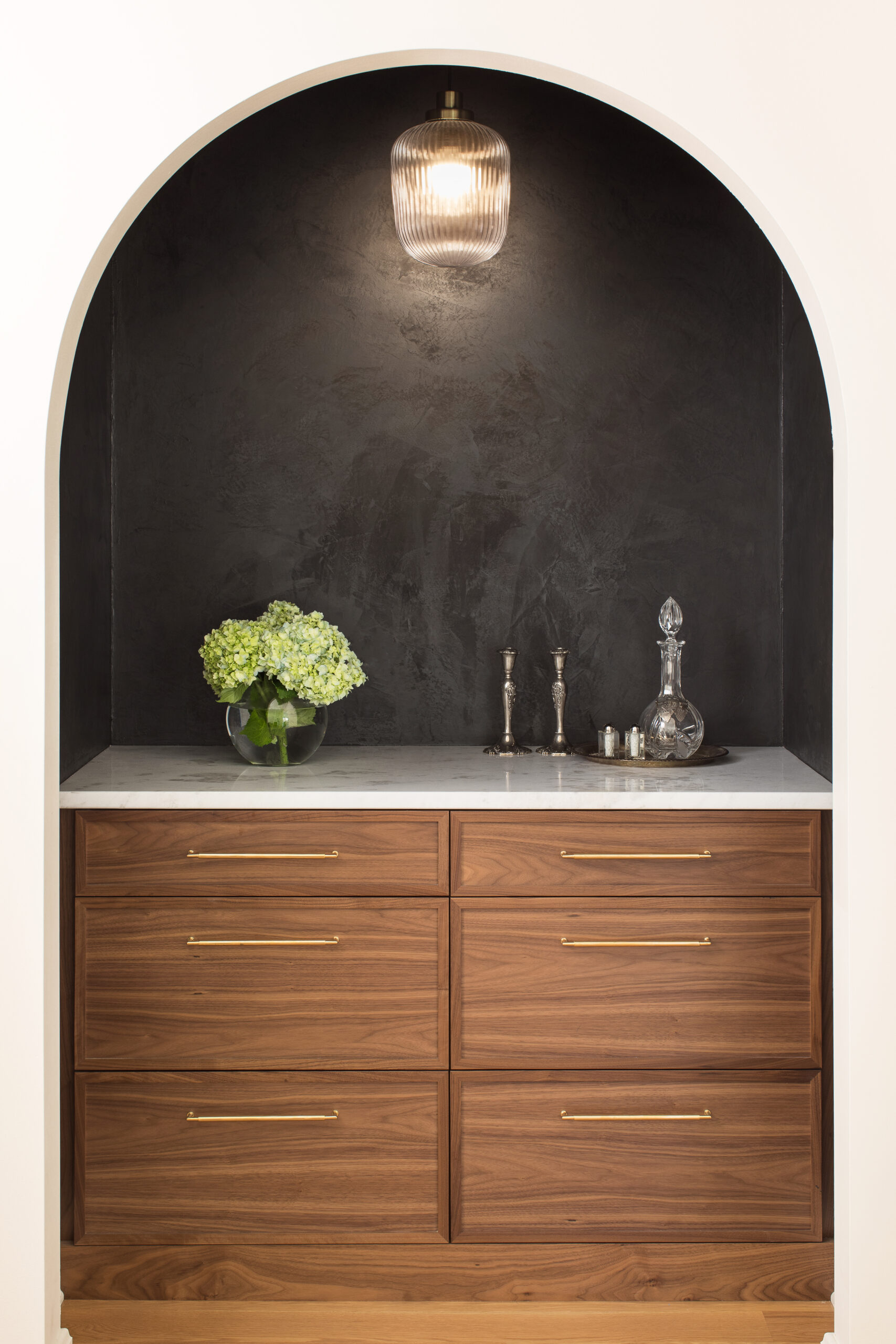
So, when Kathy first met with homeowner Sara Fredman, she came armed with lots of ideas and ready to listen. “Each and every client of mine has different needs and tastes,” says the designer. “I really do not influence my taste to become theirs. And this homeowner already had a look she was searching for, so we just needed to cultivate this aesthetic to work with her existing home.”
Located in Chesterfield, the Fredman residence is a typical 1970s colonial nestled within a large subdivision consisting of hundreds of homes built during the same era. Encompassing 2,100 square feet with little to no updates, the interiors felt dark, with a floor plan divided into choppy individual rooms.
“We chose to live in this neighborhood to be close to family and our synagogue,” says Sara, “but I’ve always preferred older houses with more character than your average suburban 1970s subdivision template. “That is why we incorporated design elements like arches, Italian plaster and natural stone. We completed the major renovations in April 2022, but I am still tinkering with the spaces, little by little.”
The renovation included moving a bathroom, changing existing openings to new locations and closing a wall for the office, giving more space in the family room for furniture placement and large family gatherings. But it was the kitchen that became the real showstopper, earning them a gold-winner spot in St. Louis Homes & Lifestyle’s 2024 Kitchens of the Year.
“I spend a lot of time in my kitchen and wanted it to be a calming space—as calm as a kitchen that serves four young children can be,” Sara jokes. “But it also needed to be super-functional with a ton of storage and not too fussy. We keep kosher and have separate dishes for meat and dairy foods, so we divided the kitchen into two distinct zones, each with a sink, a dishwasher and plenty of cabinet space. Kathy’s brilliant idea to go with two 30-inch ranges side by side allows me to multitask without it all devolving into chaos.”
They also relocated the laundry room to the second floor, which opened up an abundance of much-needed space. Kathy repositioned the hallway that leads into the dining room, which allowed it to become the center of the room and create a seamless flow between the kitchen and dining room. The renovation also freed up enough space to add a scullery, so the mess of daily kitchen activity can be tucked away and out of sight.
“Kathy really helped me pursue my design dreams with this project,” Sara notes. “I had very strong ideas about form and color, and she helped me channel them into a design that works for our family—whether maximizing my kitchen’s storage potential or opening up the back half of the house and enlarging our dining room. She also encouraged me to follow my design instincts on things I felt strongly about, like the arches, fluted walnut cabinets and the pop of color in the library.”
The library incorporates a wall of built-in bookshelves painted in a vibrant bluish-green hue. The rich color creates a warm and cozy ambiance perfect for a library’s quiet atmosphere. The room also showcases an heirloom map that has been in the family for generations. “My favorite space of all might be the library,” says Sara. “Tom, our contractor, worked with me on the initial design and Gus Wimmerbrown of Tischler Building Co. did the custom carpentry, providing atruly beautiful home for our hundreds of books and a spot away from all the chaos for reading and writing.”
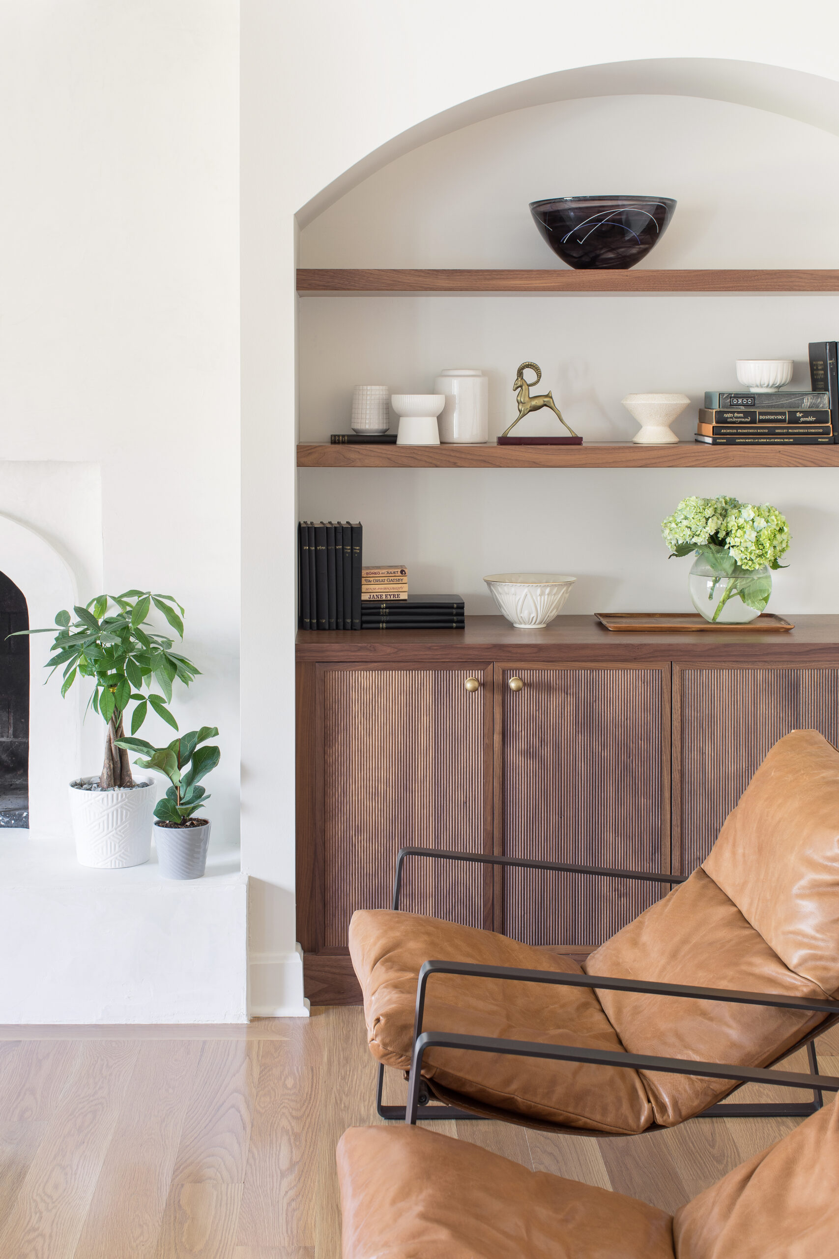
In the family room, they transformed a dated brick fireplace with italian plaster to give it a more modern feel and also removed the existing bookshelves and updated them with walnut-base units and floating shelves.
The refreshed look lends itself to the open floor plan by reducing the visual weight of the old design. They mirrored the look by applying plaster to the opposite side of the house, which inspired the sleek kitchen hood. The remodel created open sightlines from one side of the house to the other without any walls blocking the view. They enhanced the new clean aesthetic with white-oak plank flooring finished in neutral brown-gray tones.
“I love having a fire in the fireplace during the colder months, but our old hearth was very dated and cluttered,” adds Sara. “That area got a complete makeover with plaster and fluted walnut cabinets and walnut shelves inside—and, of course, arches.
Now, it’s not only a cozy space but also a beautiful and calming one. Streib Company has been great in helping us wire behind the plaster and inside one of the cabinets so the hardware and cords are hidden, and the kids’ small screens can also be stowed when not in use.”
Playing host to large gatherings regularly, the homeowners sought to create spacious rooms for big family dinners and holiday entertaining. By opening up their entire floor plan, they expanded the seating in the living spaces to accommodate everyone. Creating a larger dining room enabled them to extend a table into another room if necessary, and removing a wall from the dining room into the playroom gave them a more cohesive footprint to do so.
“Everything feels more fluid and open now,” says Sara. “The light moves more easily from the dining room into the kitchen area, and I also love enjoying the fireplace while I’m in the kitchen and having more space for the kids to relax or do their homework while making dinner. But what I love the most is spending time in all the different spaces, which is great because I spend a lot of time at home.”
“I thoroughly enjoyed learning about Sara’s family dynamic, their family traditions, and how the designs and layouts benefit family time and functionality during their gatherings and holidays,” Kathy adds. “And I especially loved hearing about how meals are prepped and prepared in advance for Sabbath—so on any given Thursday, all eight burners of their stoves could be on!”


