By: Miun Gleeson
Magazine: St. Louis Homes + Lifestyles
Architect: Accent on Cabinets
Interior Designer: Elizabeth Glazer
Photography: Rick Gould
Kathy Israel designs a kitchen suitable for all ages and occasions.

Kathy Israel, owner of Accent on Cabinets, worked with homeowner Jamie Levison and designer Elizabeth Glazer to create a kitchen that would accommodate the diverse needs of this busy family. The end result incorporates clean, modern elements that don’t sacrifice style.
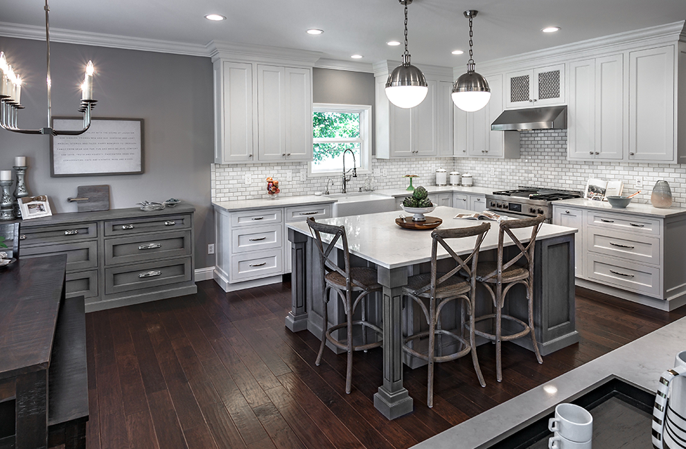
Space wasn’t an issue in the original kitchen, but it was a matter of reassessing how to leverage it in a smart way. The kitchen needed a more expansive island that better fit the scale of the space and would let the family feel more connected. The large island grounds the space and allows for seating that is conducive to family interaction. “You are able to look and interact with your family on those days that you are able to sit,” says Israel. The island also proves that high quality materials and children can peacefully coexist. Polar Stone Quartz Olympia countertops were a luxurious choice that also offers durability.
Knocking down walls is almost a given in major remodeling projects, but that wasn’t the case with the Levison kitchen. The original kitchen had two openings leading into an adjoining family room. Closing off one of the doorways by building a wall gave the family some much needed cabinet space. The wall also allowed for a built-in breakfast bar, which acts as a serving area when entertaining.
The cherry cabinets that weighed down the space before were replaced with a much cooler color palette. All-white cabinets and marble subway tile brighten up the kitchen, creating a cleaner and airy feel. Touches of geometric and textural interest keep the space from being monochromatic. One example is the wire mesh in hammered polish nickel above the range hood, which helps to break up the white cabinetry. The rounded orbs of the island pendants and vertical lines of the breakfast room chandelier also help to cultivate the transitional look the homeowner was looking for.
Perhaps the best features of the kitchen are some small hidden gems that you can’t see. Appliances from Ferguson integrated into the custom cabinets by Plato Woodwork give the kitchen a seamless furniture feel that creates continuity with the design aesthetic of the adjoining living room. More functional design choices hide behind cabinetry such as a coffee station and storage pockets flanking the stove that conveniently keep spices and utensils tucked away.
Resources
Granite Supplier/Installer: Absolute
Plumbing Fixtures Supplier/Installer: Ferguson Bath, Kitchen & Lighting Gallery
Decorative Fixture Supplier: Accent on Cabinets
Appliances: Ferguson Bath, Kitchen & Lighting Gallery
Lighting: Restoration Hardware
Woodworking/Cabinetry: Accent on Cabinets


